


WELCOME TO THE smallbiz BLOG
Smallbiz BLOG

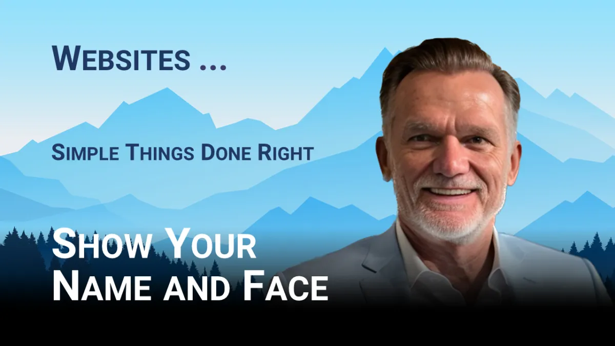
Show the Name and Face on your Website
I see about 20–30 websites a day. Some are "wow" and some are "my god". In this article, I share my experiences and offer suggestions on how to easily solve the "big issues".
My tasks in sales and customer consulting lead me to around 20–30 websites a day. It's probably like being a tradesman who is constantly visiting customers' homes.
There are big and small, beautiful and less beautiful, tidy and untidy houses. It's similar with websites.
I deliberately don't want to position myself as a website expert here, but rather to mention a few highlights from the perspective of a prospective customer that, I think, are important and that I often notice.
My motto is: Do the simple things right.
Many smaller companies use construction kits. You can see this in the layout and especially in the advertising of the construction kit provider, which usually places its linked advertising in the footer.
That looks cheap - get rid of it. Don't let your suppliers advertise on your site for free.
Otherwise, I'm a fan of construction kits because they often look very solid and better than self-built sites with the charm of 1980.
You can also recognize kits by the fact that they are often not filled.
Non-functional call-to-action buttons look silly and have a negative effect.
Just like someone I asked today why you can't book their services online. Of course, you can book online, he said, you have to click on the "Book Appointment" button. My comment "your button doesn't book anything" didn't go down very well.
He also didn't like the question whether he hadn't noticed that nobody books an appointment via the website.
Okay. None of my business😉
However, I'm not sure what I find less chic - non-functioning links for which you can still make excuses to the webmaster or half pages with text placeholders, i.e. those with "lorem ipsum ...".
For me, this is yet another quality, simply embarrassing.
However, the points mentioned are not what I notice the most and they also leave me stunned.
I see rows and rows of sites where there is no information about who runs them. "LPS Lakeshore Premium Services" is a nice-sounding company name, but ultimately, I would like to know who I'm dealing with.
My first question when I see something like this: What do these people have to hide.
For me, the name, picture, and contact information of the people I'm supposed to trust just have to be on the website. Anything else looks extremely dubious and certainly wastes a lot of business potential.
Don't forget: they want the best thing we have - our money!
The bottom line is that there are only a few things that will turn a "terrible" site into an "acceptable" one.
This small list may be enough to get you started.
Who am I dealing with?
What services are offered.
Which problems are solved.
Who should feel addressed.
In which area the company is active.
What project examples are available.
What experiences have customers had.
These are just 7 points that make a big difference.
By the way: The ChatboOne system includes a website builder with which this page, for example, was completely created.
If you like our site and want to know more about what else ChatboOne can do - just hit "Click for Appointment" below (the link works reliably).
#ChatboOne
#RetainClients
#Identify New Leads.
#UnburdenTheTeam

Copyright 2026 Chatbo LLC - All Rights Reserved - ^^^






LinkedIn
Facebook
X
Instagram
Youtube
TikTok